Widgets
Context Cards
Context Cards provide an immediate preview of an entity. If the entity has been annotated and, if links are active, WordLift will show a preview of the annotated entity.
By default context cards will show up on hovering if Links to Entity Pages are enabled. To disable context cards, add the following code to your theme:
The context card itself is wrapped within a class wl-context-card You can style this class and the child element classes using CSS. Other classes that you can use to style the context cards:
wl-context-card__image- Image elementwl-context-card__description- Wrapper element around complete descriptionwl-context-card__description__logo- Publisher logo image elementwl-context-card__description__text- Wrapper element around description text
Advanced Filters to override default behaviour
Javascript Filter wl_context_cards_load_fn_supplier
This is a function supplier filter that the context card applies if provided. This filter can be used to supply a function that overrides the the default function that returns a fetch (or any other request library) promise.
This filter receives two arguments:
- Endpoint of the context cards (
url) - DOM element that triggered the context card (
el)
The filter is expected to return a fetch (or any other request library) promise with the desired request.
Here's a sample implementation of this filter:
const settings = global["_wlEntityRedirectSettings"];

addFilter("wl_context_cards_load_fn_supplier", "wordlift", (defaultFn) => {
    return (url, el) => {
        const enabled = el.getAttribute("data-entity-redirect-enabled");

        // If entity redirect isn't enabled for this target, then return the defaultFn.
        if ("true" !== enabled) return defaultFn(url, el);

        const join = -1 === url.indexOf("?") ? "?" : "&";
        // should load things
        const ids = el
            .getAttribute("data-id")
            .split(";")
            .map((s) => encodeURIComponent(s));

        const params =
            `${join}website=1&entity-redirect=true&id[]=` + ids.join("&id[]=");

        return fetch(`${settings.url}${params}`)
            .then((response) => response.json())
            .then((json) => {
                // Return the JSON if it contains at least 2 elements (i.e. an entity and the web site).
                if (1 < json.length) return json;

                // Otherwise return the default function.
                return defaultFn(url, el);
            });
    };
});
PHP Filter wl_anchor_data_attributes
This filter lets you add custom data attributes to <a class="wl-anchor" /> links in the post. This received existing attributes and the post_id. Here's a sample implementation of this filter:
add_filter( 'wl_anchor_data_attributes', function ( $attributes, $post_id ) {

    return $attributes + array(
            'entity-redirect-enabled' =>
                ( Wordlift_Entity_Redirect_Status::is_enabled( $post_id ) ? 'true' : 'false' )
        );
}, 10, 2 );
Faceted Search
Entity pages can be used for helping users browse the content of your website. This is done using the Faceted Search Widget. The Widget can be added on the entity page using the Faceted Search option from the Widgets Dropodown Menu
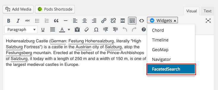
Alternatively, the [wl_faceted_search] shortcode can be used.
- Faceted Search : Provides a faceted search user interface to help readers discover relevant articles using the network of entities.
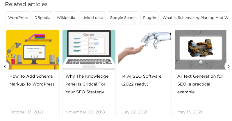
The example above represents the widget displayed in the front-end. The reader can select multiple concepts and highlight the list of articles related to these concepts.
Navigator
The Navigator widget by default is wrapped in a wl-navigator class. You can style this class and the child element classes using CSS.
Optionally, while using the navigator, you can also specify a template_id to style a specific instance with its own template.
The template can be written using Mustache: a framework-agnostic way to style web components.
Here's a sample code that you can use as reference:
<script id="wordlift_navigator_sidebar_template" type="text/mustache">
{{#items}}
<div class="related-articles__item">
<a class="related-articles__img" href="{{post.permalink}}"><img src="{{{post.thumbnail}}}" alt="{{{post.title}}}" title="{{{post.title}}}"></a>
<div class="related-articles__content">
    <h4 class="related-articles__title"><a href="{{post.permalink}}">{{{post.title}}}</a></h4>
</div>
</div>
{{/items}}
</script>
As a theme developer you have complete flexibility on both: the contents of these templates and the CSS styling. Read here the parameters supported by the Navigator widget.
Examples
Personalization of the Navigator Widget
The Navigator widget by default is wrapped in a wl-navigator class. You can style this class and the child element classes using CSS.
Optionally, while using the navigator, you can also specify a template_id to style a specific instance with its own template.
The template can be written using Mustache: a framework-agnostic way to style web components.
Here's a sample code that you can use as reference:
<script id="wordlift_navigator_sidebar_template" type="text/mustache">
{{#items}}
<div class="related-articles__item">
<a class="related-articles__img" href="{{post.permalink}}"><img src="{{{post.thumbnail}}}" alt="{{{post.title}}}" title="{{{post.title}}}"></a>
<div class="related-articles__content">
    <h4 class="related-articles__title"><a href="{{post.permalink}}">{{{post.title}}}</a></h4>
</div>
</div>
{{/items}}
</script>
As a theme developer you have complete flexibility on both: the contents of these templates and the CSS styling. Read here the parameters supported by the Navigator widget.
Personalization of the Context Cards
Context Cards provide an immediate preview of an entity. If the entity has been annotated and, if links are active, WordLift will show a preview of the annotated entity.
By default context cards will show up on hovering if Links to Entity Pages are enabled. To disable context cards, add the following code to your theme:
The context card itself is wrapped within a class wl-context-card You can style this class and the child element classes using CSS. Other classes that you can use to style the context cards:
wl-context-card__image- Image elementwl-context-card__description- Wrapper element around complete descriptionwl-context-card__description__logo- Publisher logo image elementwl-context-card__description__text- Wrapper element around description text